


The starting point
Lilli Paris sells personalised initial rings, and its bestseller is the Adjustable Initial Ring. Most of the traffic to that product page comes from paid social ads, straight onto a phone. So the first screen of that one page decides most of the store’s sales.
On our intro call we went through their funnel together, and nothing looked obviously broken. So the gains had to come from the details of that one product page, and that meant doing the research before touching the design.
The old page made the shopper work for the basics. Finish and size sat in dropdown-style boxes, the second-ring offer was a line in the announcement bar, far away from where she decides, and the review section looked dated next to the rest of the brand.
What we looked at first
The numbers. We put heatmaps and scroll maps on the page and read them next to the store’s analytics. Almost every visitor was on a phone, arriving from a paid social ad, so we designed for the first mobile screen and built the rest of the page around it.
What customers and the founders told us. We asked the founders why people buy a second ring. The answer was couples, best friends, and one ring for yourself plus one for a partner or child. A second ring is a gift, and that shaped how we presented the offer. They also felt the review section didn’t do the brand justice.
What competitors do. We studied the product pages of other personalised jewellery brands, including a direct competitor. Its first screen was close to what we had designed, which confirmed the direction. Where it was ahead was the review section, so we rebuilt ours to read cleaner.
What the page asks of the shopper. Every choice she has to make before adding to cart: finish, size, two initials, and whether to take the second ring. Each one hidden in a box is a reason to stop.
Then we checked the page against our 600+ conversion guidelines. The ones that mattered most here: show every option as a tap instead of a dropdown, put the offer where the decision happens, make the savings maths add up at a glance, keep the reviews clean and easy to read, and put the reasons to trust the order right under the button.
Round 1: the redesign
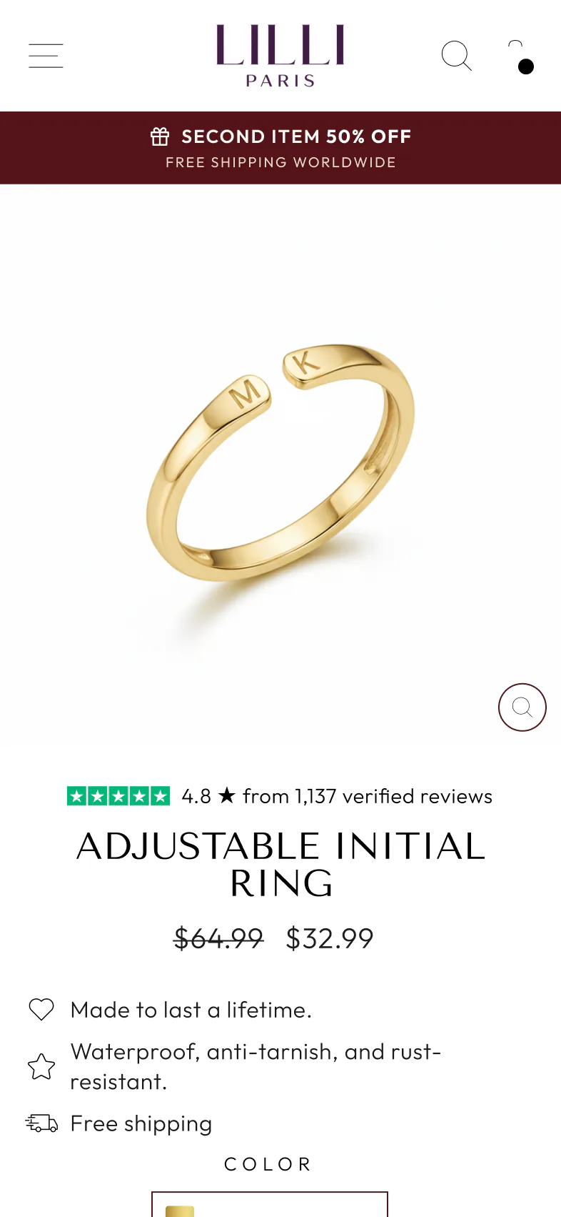
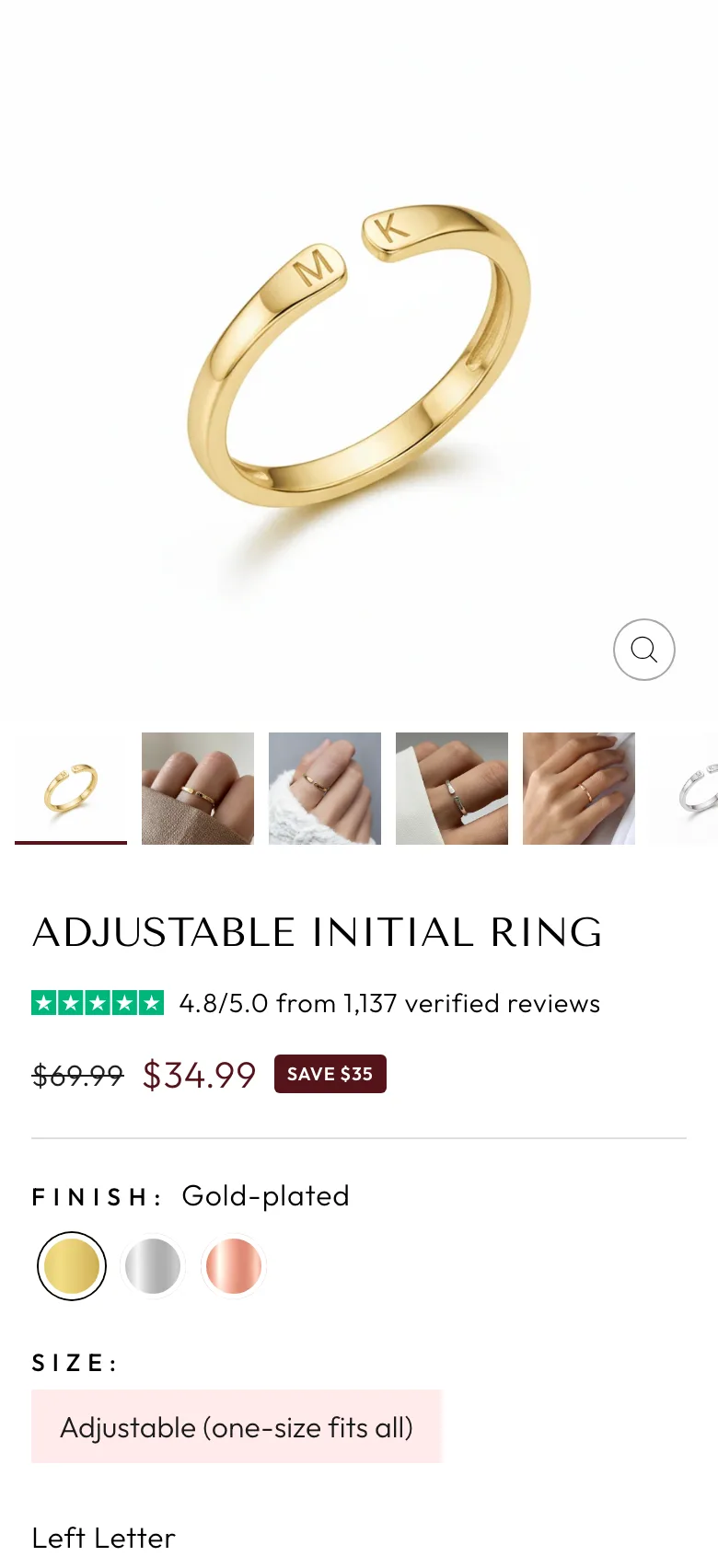
We rebuilt the page around those choices:
- Finish swatches for gold, silver and rose, and the size shown as a single one-size pill, so she sees every option and picks with one tap.
- Trustpilot stars and the review count right under the product name.
- The price with the saving next to it, and the price inside the add to cart button.
- The initials as a clear last step, right above the button, so she knows exactly what’s left before she can buy.
- Free shipping, a 2-year warranty and 30-day returns under the add to cart button.
- A cleaner review section that matches the brand.
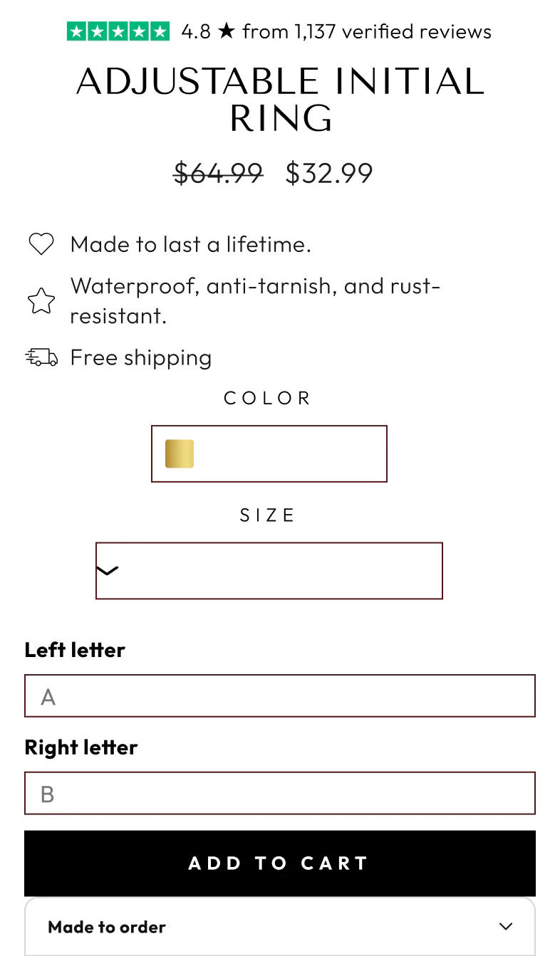
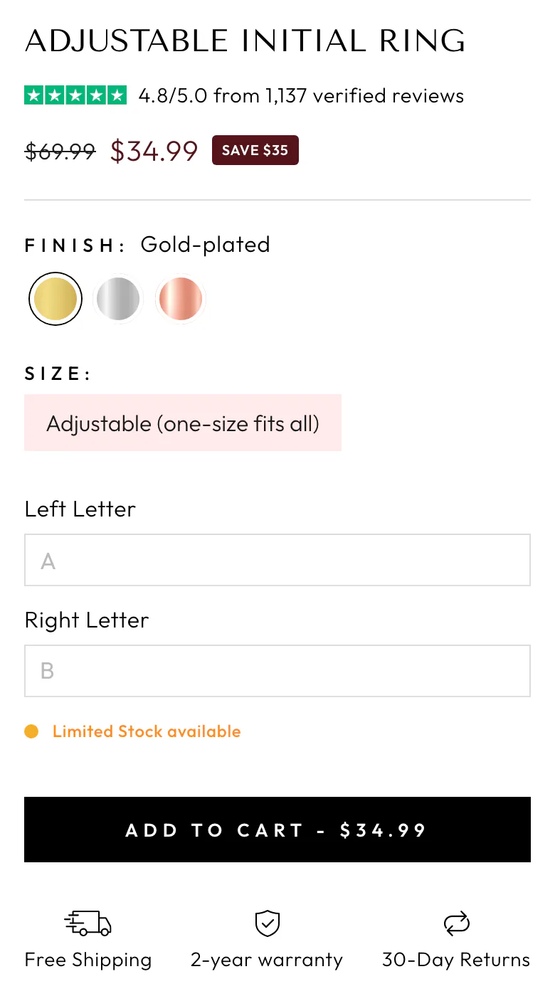
We tested the new page 50/50 against the old one.
The result: conversion rate up 6% and revenue per visitor up 5%. Our split testing tool projects about $15,200 a month in extra revenue. We rolled the new page out to all traffic.

Round 2: make it a pair
Round 1 won on conversion while order value held flat. So the next test went after the second ring, the reason people buy two.
Lilli Paris has enough traffic to read a test within days, so instead of another full redesign we tested one idea at a time on top of the new page, keeping what works and cutting what doesn’t.
- A “Make it a pair” builder: both rings, both sets of initials and the half-price second ring in one place, with the pair price shown against the full price. We put it below the product details, so the first screen stays clean.
- The brand story, “Your story. Worn close to her heart.”, placed right after the pair builder, so the reason to buy two sits next to the offer.

We tested it 50/50 against the live redesign.
The result: revenue per visitor up 18% and conversion rate up 18%, with order value holding steady. More shoppers bought, and more of them bought two rings: orders with two rings went from about 1.0 to 1.4 per 100 visitors. Our split testing tool projects about $15,000 a month in extra revenue.

Both rounds together
Across the two tests, revenue per visitor on the Adjustable Initial Ring page went up by about 24%, and our split testing tool projects about $30,200 a month in added revenue.
Out of our last 20 product page redesigns, 19 beat the page they replaced in a live A/B test.